Improved Conversions by 118%
Football NFT Marketplace is a global football platform built on the blockchain, with a mission to revolutionise the economics of football by creating new revenue opportunities for clubs, associations, and fans. Their first project involves the development of an NFT marketplace specifically for collecting football cards on the blockchain. The marketplace features official licensing rights for 65,000 professional footballers across 67 countries, making it an exclusive and comprehensive collection.
The Football NFT Marketplace primarily targets football fans, gamers, crypto-native enthusiasts, and sports item collectors. The platform aims to attract individuals who are passionate about football and interested in the emerging world of blockchain and NFTs. By catering to a diverse audience, The Football NFT Marketplace creates a vibrant community that fosters engagement, competition, and collaboration.
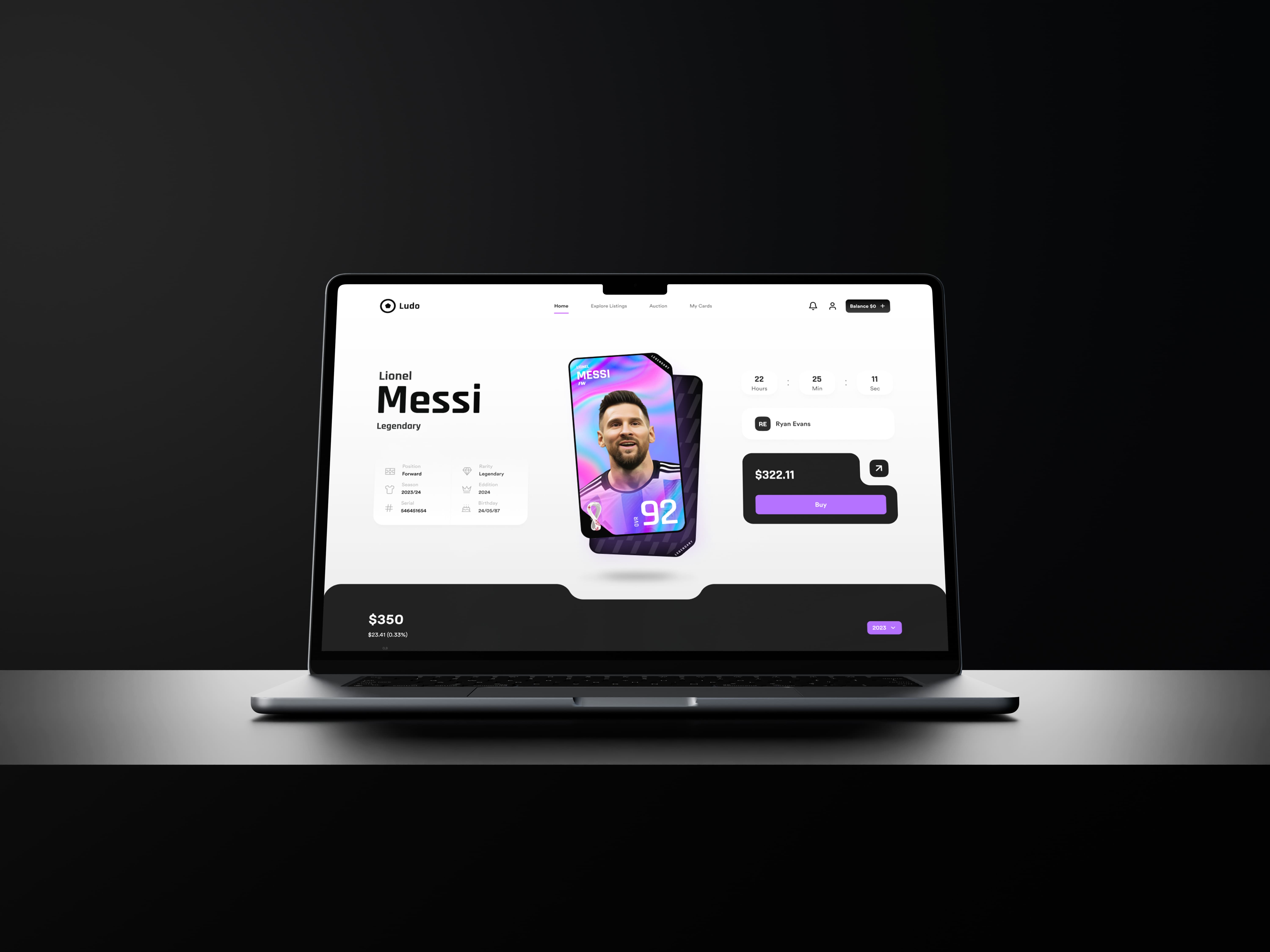
I was asked to create a user-friendly marketplace where fans can purchase NFT football cards. The primary focus is on designing a seamless user experience that includes a simple sign-up process and a secure checkout system with KYC (know your customer) verification with a smooth checkout experience.
Overall, the goal is to create a user-friendly and secure marketplace that enhances the fan experience of purchasing NFT football cards. The design should be visually appealing, the user journey should be intuitive, and the checkout process should inspire confidence in users.
We started a discovery phase allowing for a comprehensive understanding of the client's business goals and the competitive landscape. By researching competitors, we gained insights into industry best practices and identified opportunities to differentiate the marketplace.
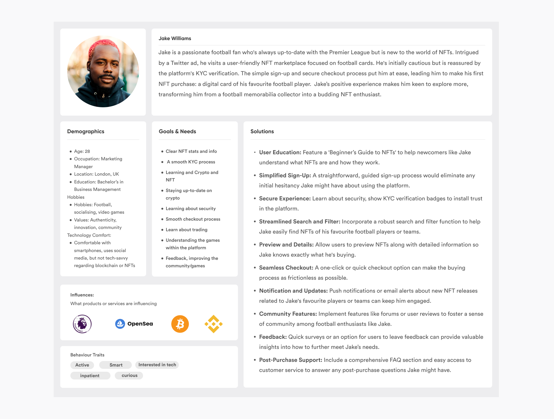
I define the various user segments that will interact with the product by creating detailed user personas. These personas illuminate the primary concerns and requirements of our target users, specifically designated for 'Novice Users' and 'Technical Users'. Our core audience comprises football enthusiasts between the ages of 18 and 35, who possess a basic and solid understanding of blockchain technology and NFTs. This initial phase is critical, as it enables us to swiftly identify the unique needs of each user type. Later I will validate these personas with real users.
Jake requires an educational journey that deepens his understanding of cryptocurrencies and the mechanics of NFTs. By offering comprehensive resources on whitepapers, security measures, hardware storage, and efficient exchange utilisation, we can facilitate his learning experience. As a result, Jake is more inclined to place his trust in our platform, recommend it to his circle, and thereby bolster long-term loyalty.
For Sarah, who possesses a greater level of expertise in cryptocurrency, a more bespoke user experience would be better maybe. Given her advanced knowledge, Sarah might be interested in joining our 'Pro Community' and could contribute constructively to more technical discussions.

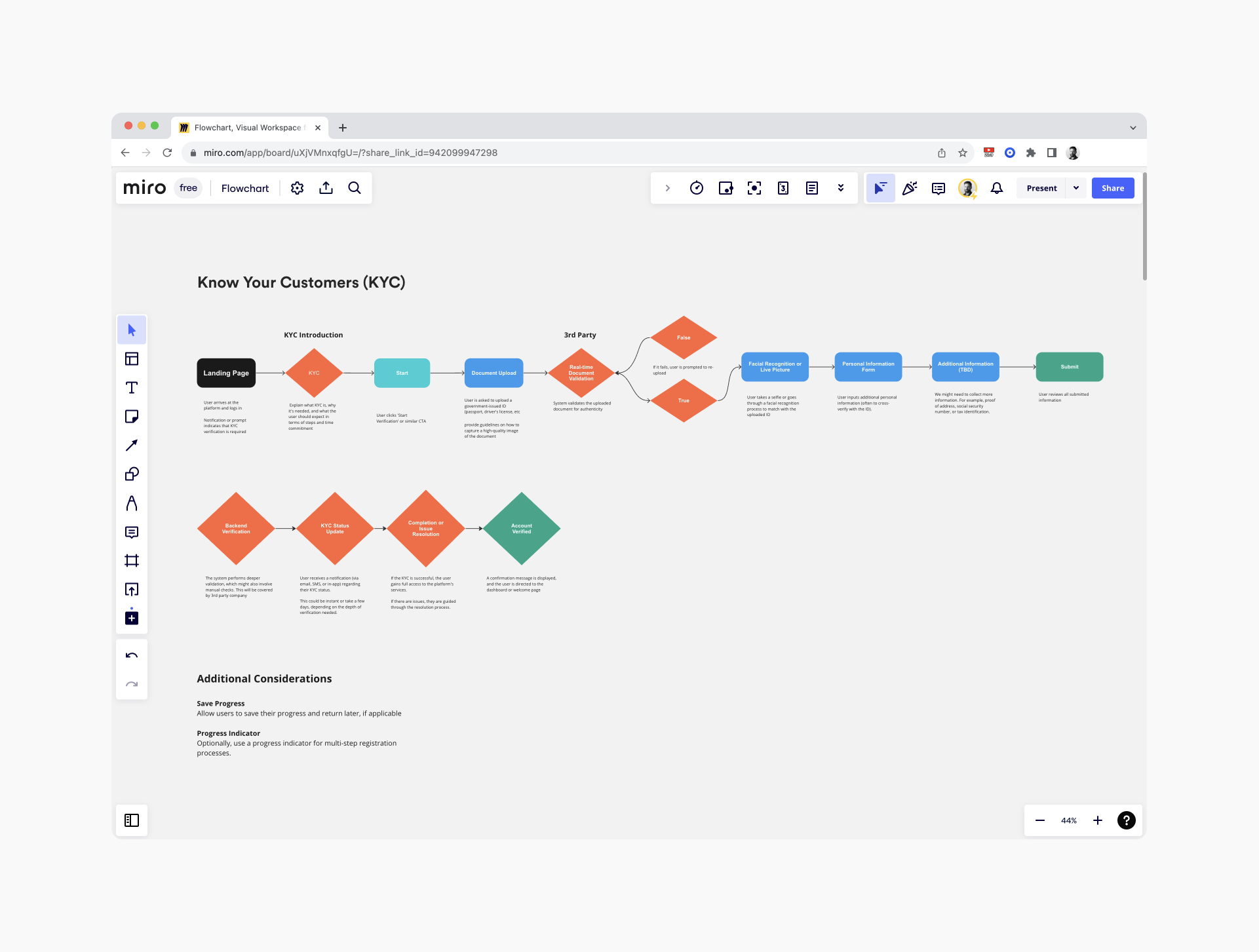
Creating user journey maps, we gained a comprehensive understanding of the various pain points that users are likely to encounter. This helped me ask the right questions to the percipients in the user testing phase.

I took the lead in developing high-fidelity prototypes to visualise the design, layout, and functionality. From creating prototypes we are able to start gathering qualitative feedback.
For user testing, the team utilised Maze, a software platform with which was my first time using. Maze provides a comprehensive suite of testing methodologies, proving pivotal in uncovering user pain points. Our initial course of action involved defining the questions and hypotheses we aimed to explore, guided by insights from our mapped user journeys. Adhering to the principle that "Why 5 Participants Are Okay in a Qualitative Study, but Not in a Quantitative One," we selected five user testers in alignment with our target demographic. These testers were divided into two categories: 'Novice User' and 'Technical User'. Key findings from this user research are detailed below.
It's worth noting that stakeholder involvement is integral to this process, as their collective input serves to clarify what precisely we are attempting to discover or resolve.
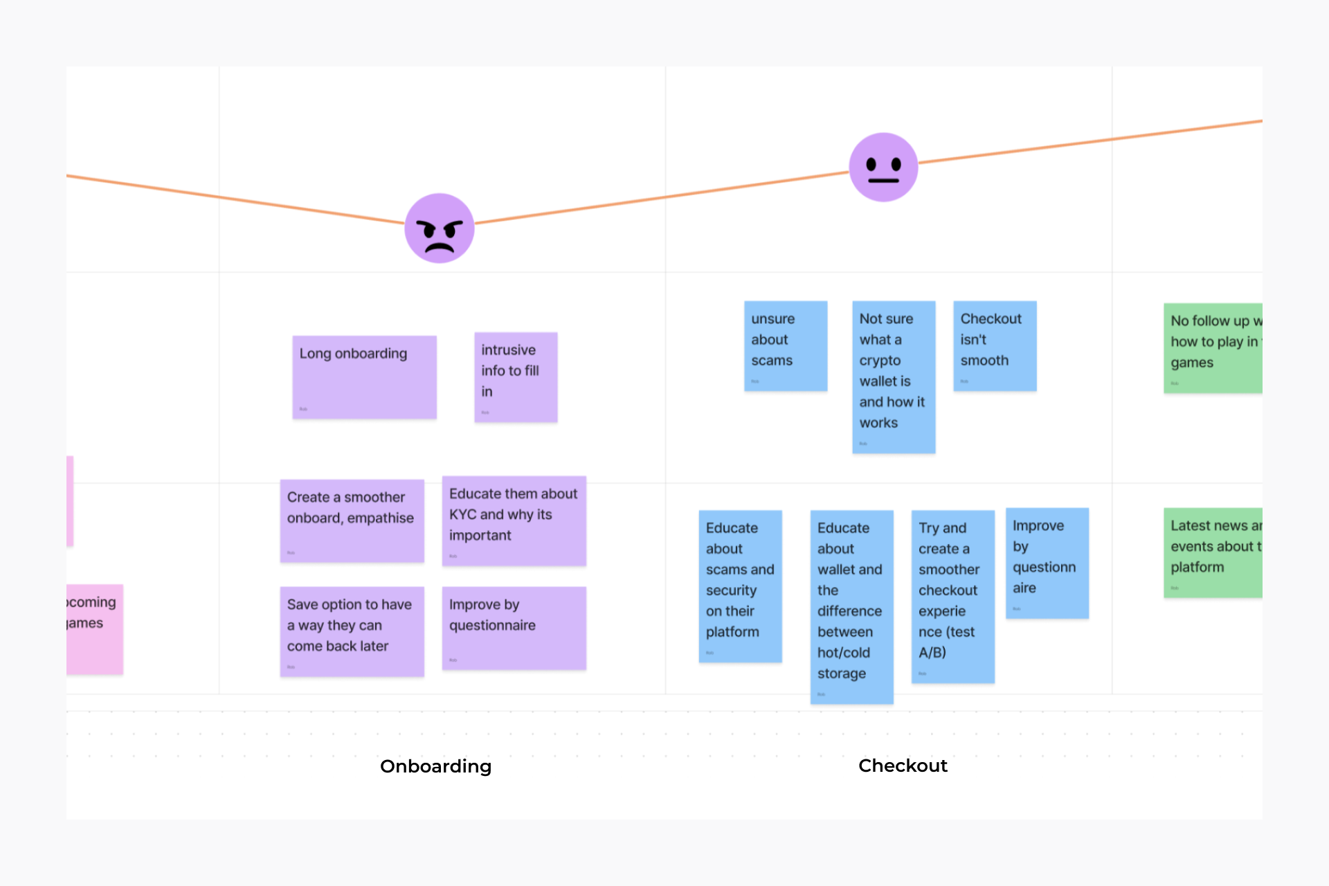
Here's some of the key takeaways from the interviews
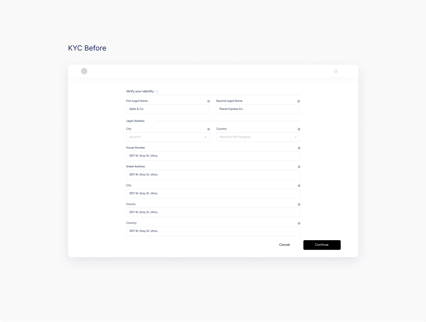

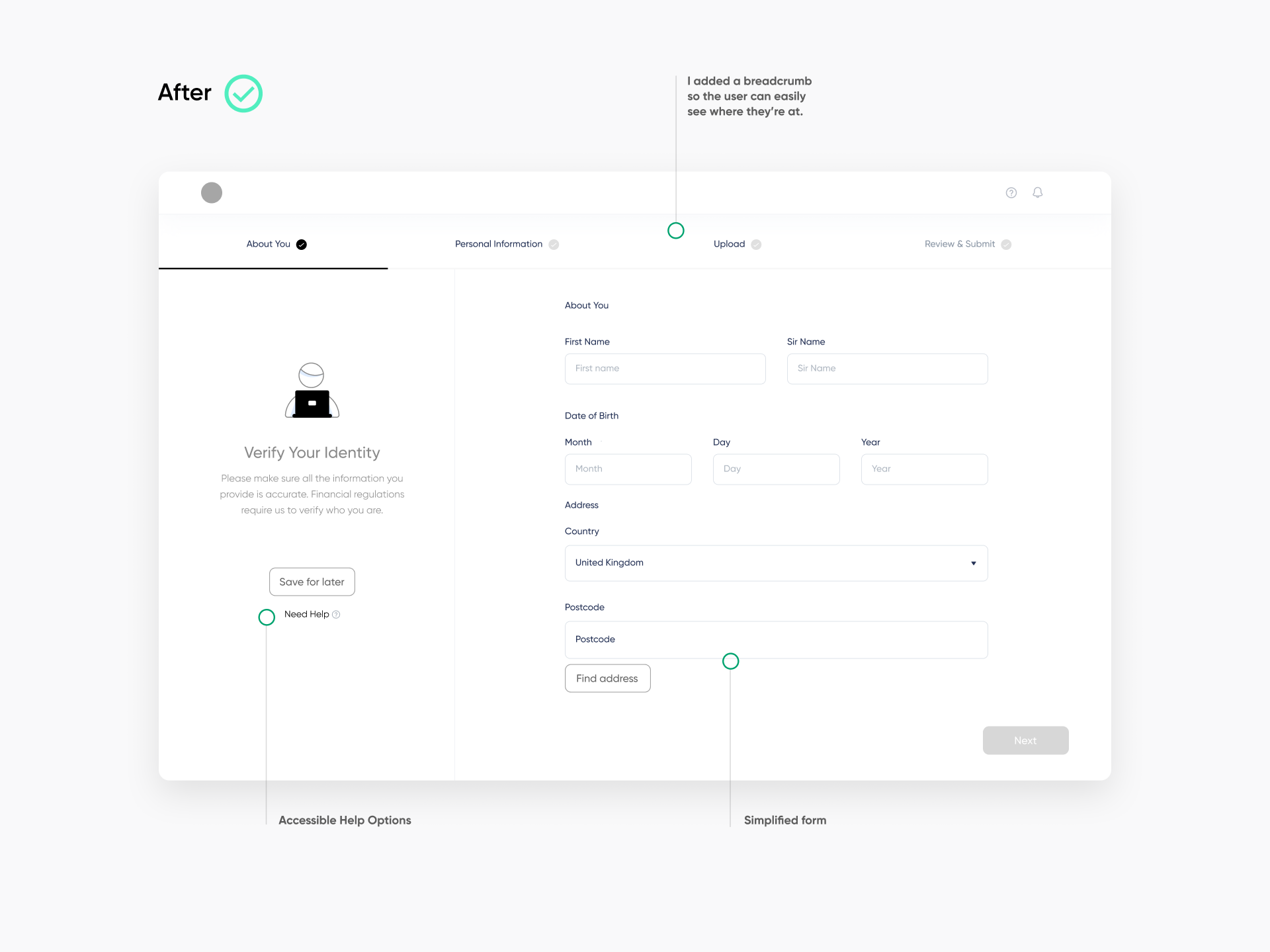
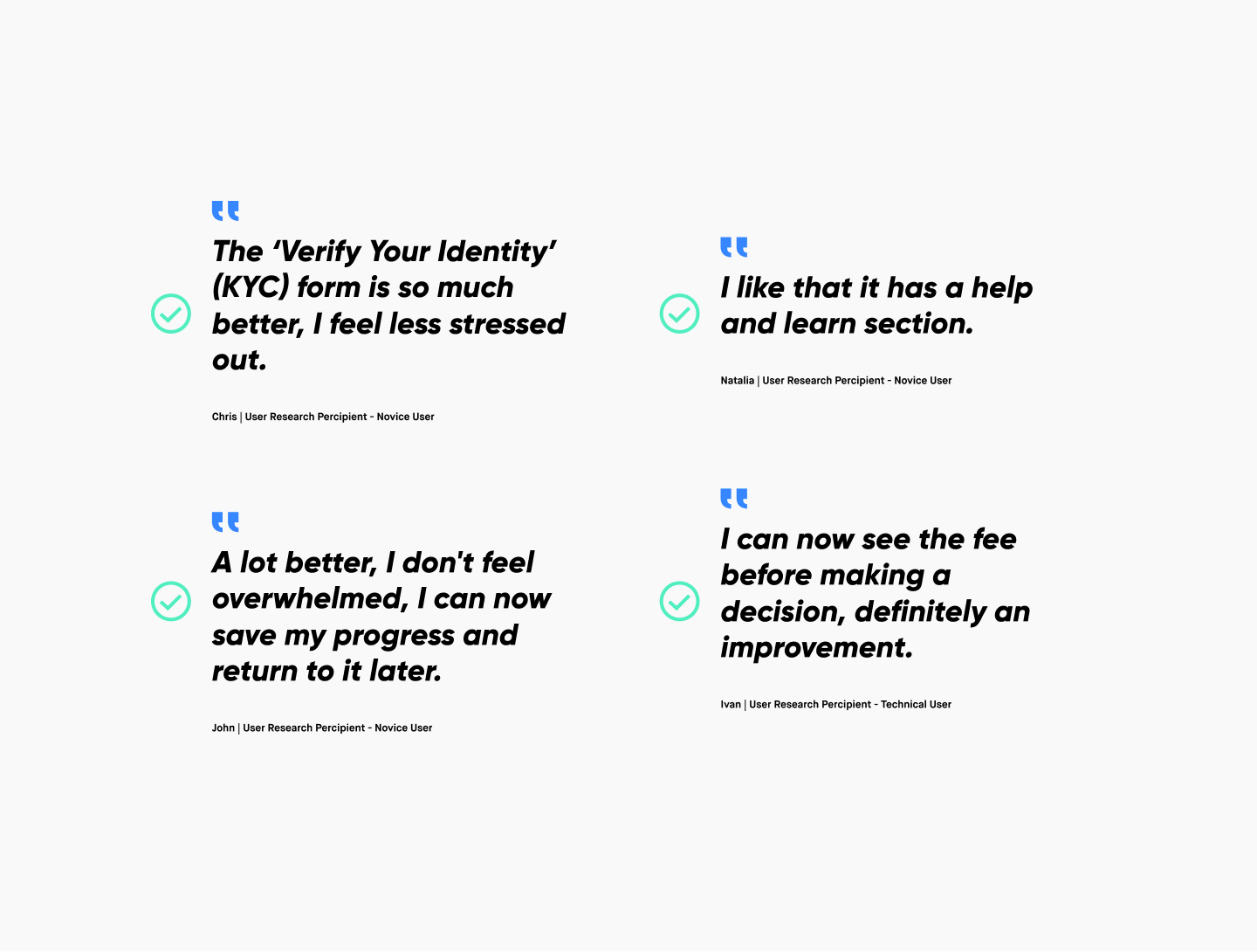
Our research indicates that completing Know Your Customer (KYC) forms can be an intimidating experience, especially for individuals new to the cryptocurrency sector who may find the level of personal information required intrusive. My goal is to foster a more accessible and reassuring experience, elucidating the necessity of submitting personal documents. Feedback revealed that users felt overwhelmed by the extensive personal information requirements; one participant even questioned the need for such detailed data collection.
In our previous design, we lacked informative tooltips, real-time validation, and accessible help options to assist users during this critical process. While we are constrained in terms of the number of form inputs and due to the mandatory nature of this part of the process, we have partnered with a third-party solution to securely collect and verify KYC documentation, ensuring compliance with local regulations. Despite these limitations, we can enhance the user experience through visual cues, transparent processes, and helpful indicators. Below are some of the improvements I've implemented.
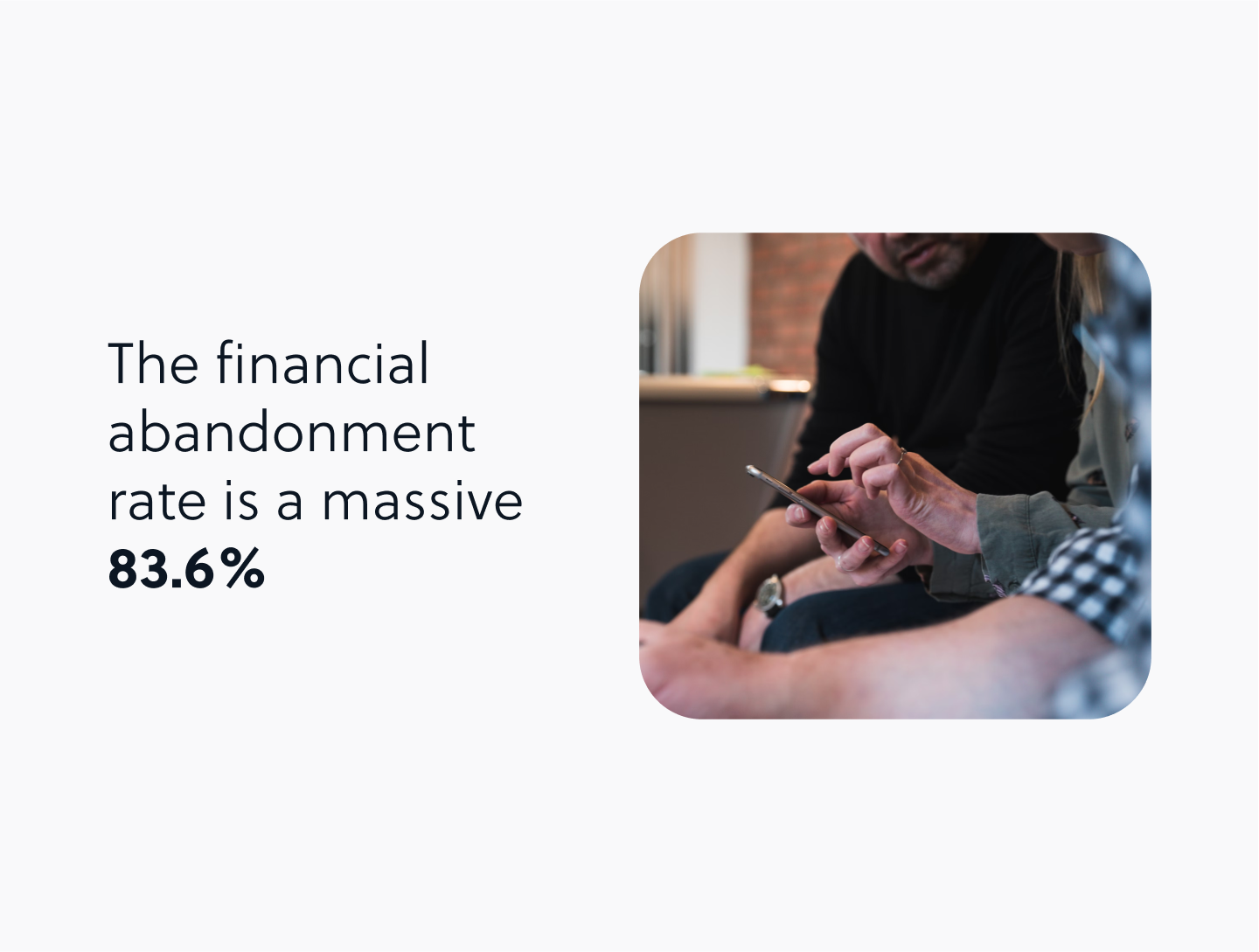
Streamlining the payment process is crucial when designing for any shopping cart experience, studies and surveys in the general e-commerce space has seen checkout abandonment rates ranging from 60% to 80%. Heres an interesting article that talks about the different abandonment rates.
Elements such as transaction fees, security concerns, and verification procedures can significantly influence the rate of cart abandonment. Enhanced UI/UX design, coupled with streamlined checkout processes, can contribute to reducing this rate.
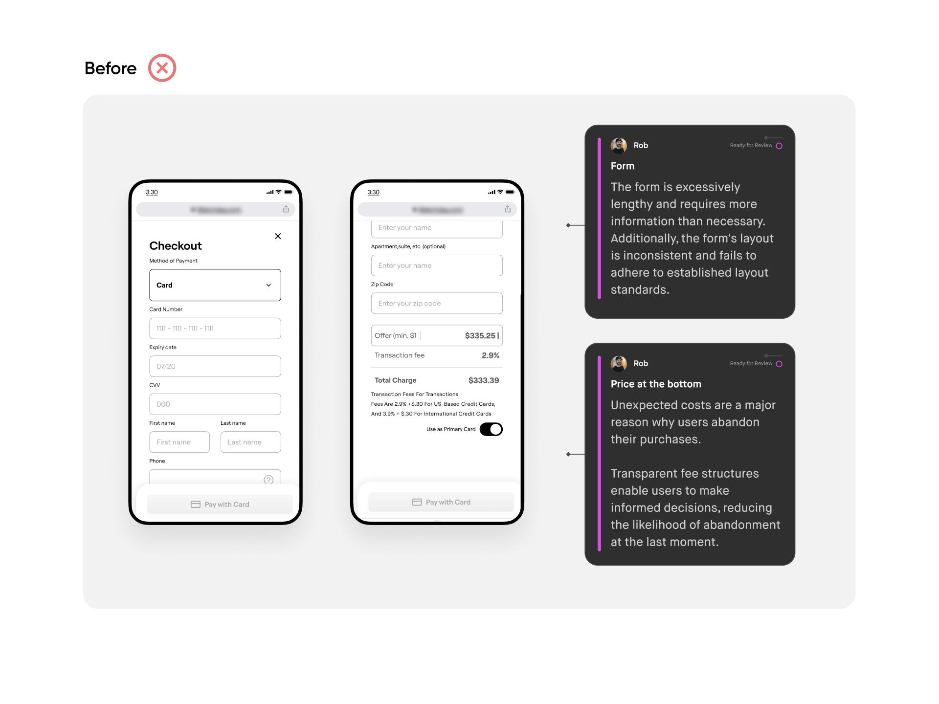
We have gathered feedback regarding the complexities of making purchases with a new bank card. In our initial prototype, the payment process of using a bank card is not straightforward. I am keen to explore alternative methods to create a more user-friendly experience.
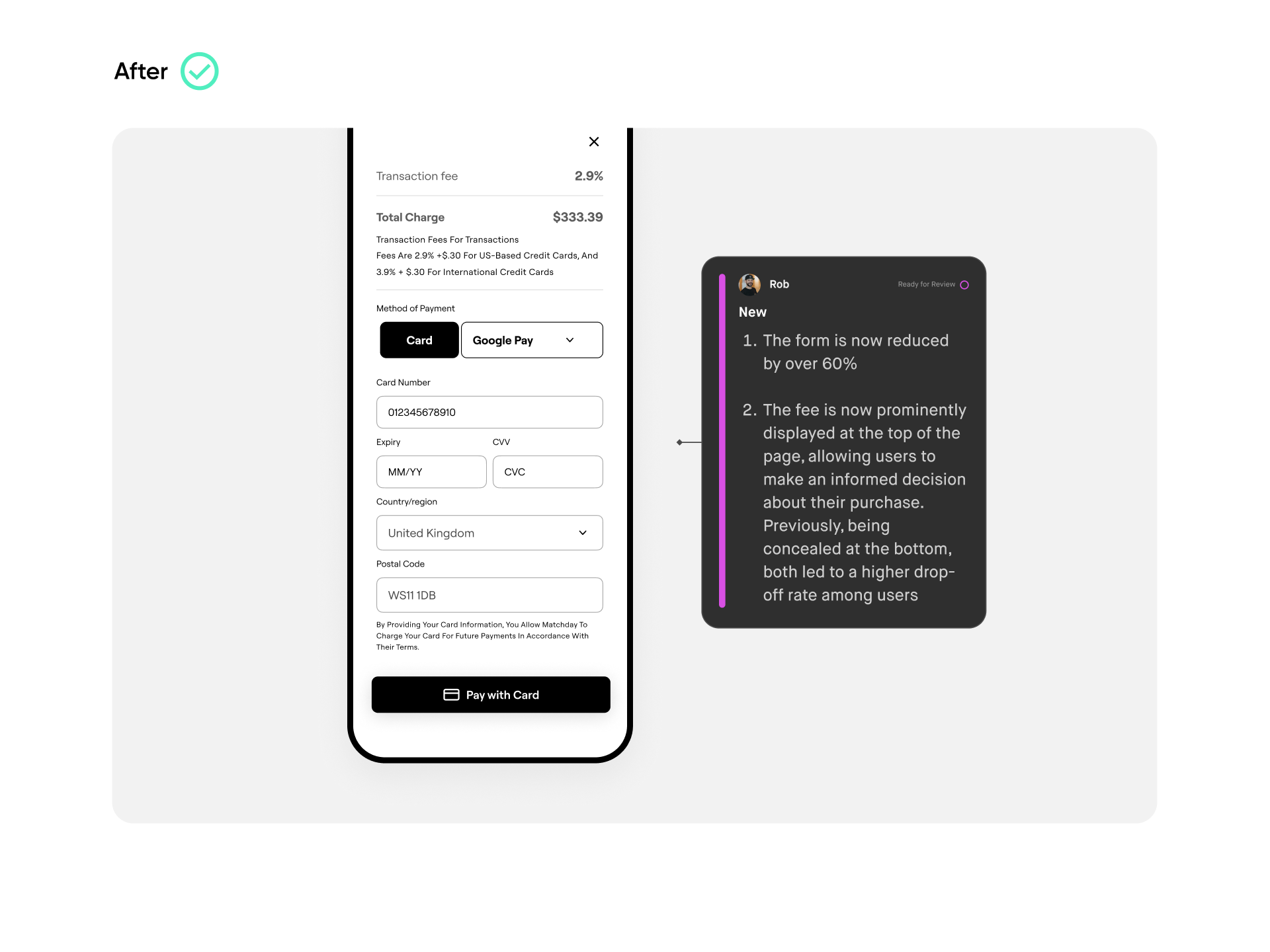
The transaction fee is positioned at the end of an extensive form, revealing the charge only after the user had inputted their details. For the sake of transparency and trust, it's crucial that we make the fee visible at the outset of the form-filling process. Unexpected costs is a major reason why users abandon their purchases. Transparent fee structures enable users to make informed decisions, reducing the likelihood of abandonment at the last moment.
As cryptocurrency remains an emerging technology that we anticipate will gain universal adoption, we've allocated a dedicated educational space. This section aims to enlighten users about NFTs and cryptocurrency, underscoring the importance of fostering wider understanding and adoption
Given the heightened sensitivity around transactions involving crypto and valuable digital assets, security assurance is a top priority. Consequently, FAQs and live support options are prominently displayed on the user interface to address any queries or concerns users may have during the process.
Fine-tuning the visual direction represents a crucial stage in the UI design process. By aligning with brand guidelines, this phase allows me to explore various design alternatives and zero in on the most suitable aesthetic for the project.
Not only should the visual strategy captivate on an aesthetic level, but it must also harmonise with the project’s goals and resonate with the intended audience.
Gathering visual references—be they images, websites, or other design inspirations—is key to establishing the overarching style and mood you aim to convey. This encompasses considerations such as colour palettes, typographic selections, and additional design elements. Such meticulous preparation not only invigorates the user interface but also ensures alignment with the project brief, edging closer to a successful project completion.
This project remains in a continuous state of development and is subject to ongoing A/B testing. Thus far, I've crafted a user experience that is both simple and clean, and I'm exceptionally pleased to be part of this journey.
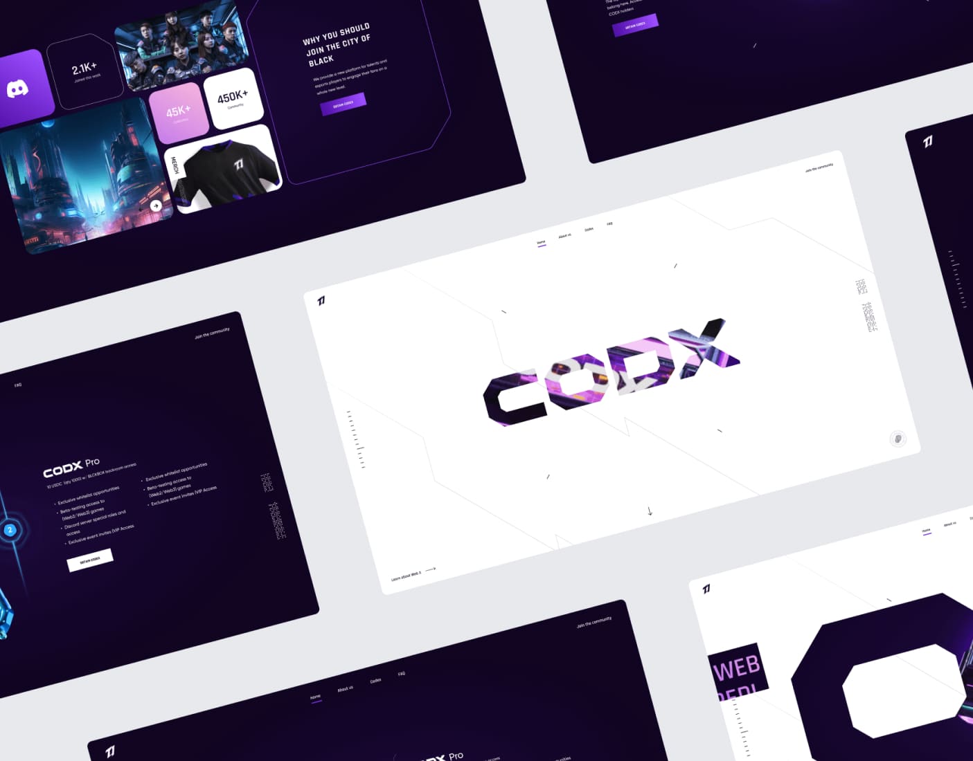
Gaming NFT
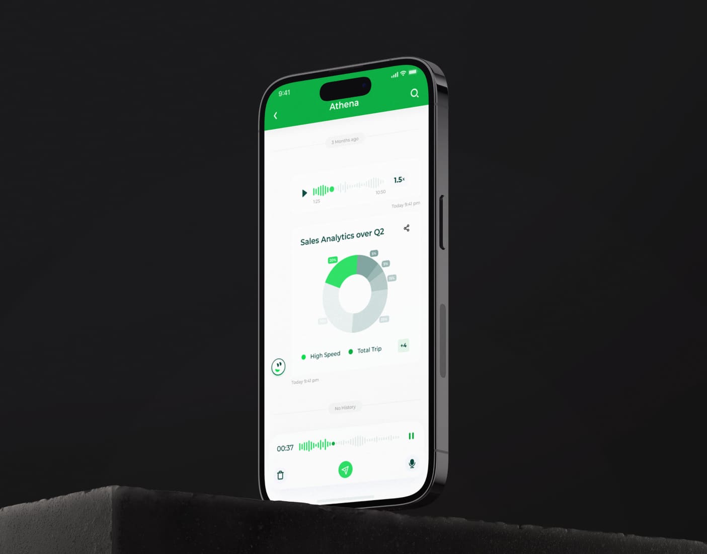
AI Powered Analytical Tool
Past Projects